
They finish signing up and stop moving
The account is ready. The next useful action is buried behind setup, choices, or an unfamiliar screen.


A setup call gets someone moving. A support message explains the next step. A workaround keeps the task on track. Repeated support requests show us which steps to review first.
The account is ready. The next useful action is buried behind setup, choices, or an unfamiliar screen.
Your team knows the answer by heart. New users keep needing it because the experience still leaves the same gap.
Users switch screens, repeat information, or ask someone else to finish what they started.
I use interviews and usability testing to find out why users get stuck, then redesign the steps, labels, or instructions causing the problem.
Selected projects showing the research, user flows, and design decisions behind the finished screens.
Product design · Lead UX/UI and brand
Different users. Clearer starting points.
Product direction and interface work across consumer, enterprise, and developer experiences in media localization.
Team research and mobile prototype
Make plant-care advice easier to find.
A plant-care prototype with revised resource navigation after usability testing.
Student research and mobile concept
A clearer first step into mentorship.
Research, user flows, and a mobile concept connecting students with mentors and a community.
Website and brand design
Make the path to care easier to understand.
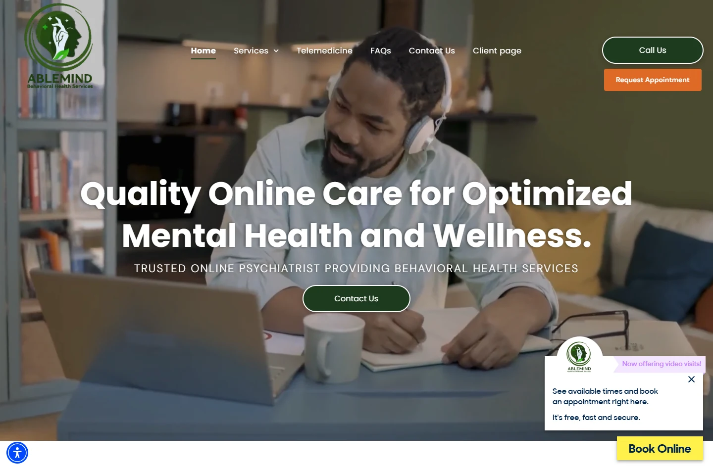
A website explaining care services, teletherapy, insurance, and how to contact the practice.
Brand, website, and print
One recognizable business across every touchpoint.
A connected identity for an event-services company, from its website to its printed materials.
Bring the sign-up flow users abandon, the task that needs a workaround, or the product idea you need to test. We’ll define the design work around that specific problem.
I review sign-up, navigation, and key tasks to find unclear labels, missing instructions, and unnecessary steps. You get a prioritized list of issues and recommended fixes.
Usability issues documented, with the recommended fixes in priority order.
I map each step users need to complete a task, then design the screens and instructions for it. Wireframes and prototypes let your team review and test the flow before development.
Task flows, screen designs, and prototypes your team can review and test.
I organize your services, project examples, and contact options so visitors can see what you offer, why it fits their needs, and how to get in touch.
Page layouts that explain your offer and direct visitors to contact or sign-up.
I use interviews, support feedback, and walkthroughs of key tasks to identify where users stop, repeat work, or ask for help.
Personas summarize users’ goals and common problems so the team can design around them.
I map the order of steps, the information users need, and the choices they make. Wireframes let us review and change that sequence before designing the finished interface.
Wireframes make the proposed path visible before the interface is fully developed.
A prototype lets people try the proposed experience. Usability testing helps reveal unclear labels, missing information, and steps that need another pass.
In GreenThumb, usability testing identified problems in the resources tab. The team revised its navigation.
We agree on the task to improve, the design deliverables, and how to check whether users can complete it.
Discuss your projectStart with something useful
Review the page people see before they take the next step. Check your offer, message, evidence, and calls to action, then choose one improvement to investigate.
A guided self-review using the evidence on your page.
Recommendations from a manager and a design teammate.
He brings both creativity and thoughtful problem-solving…
He was always focused on the user and ran usability testing with participants.
Excerpts from LinkedIn recommendations.
Read the recommendations
I’m Anxhel Koja. Call me Angelo.
My background spans design, sales, and operations. I look at what customers were promised, what they need to do in the product, and where your team has to step in to help.
That means reviewing the screens alongside setup calls, support questions, and manual workarounds. Those details help me identify what the design needs to fix.
ANX Design is my independent studio. You work directly with me, from understanding the problem to working through the design.
More about AngeloStart a conversation
The setup that needs a call. The workflow with the workaround.
The screen that keeps sending people to support.
We’ll start there and discuss the design work it needs.
Book a conversation anxhel@anxdesign.com